RTE Pitch -
Design development
I was given the opportunity to work on a pitch for Irish broadcaster RTE. RTE felt their brand had become dated and needed a complete refresh.The client wanted to engage
with their growing youth audience.
There were three concepts and I was briefed
to development the 'Shape Shifter' route.
The concept was an organic shape that
could shift from the master logo through
to the sub-brand world eg. RTE 1, RTE News,
RTE Sport etc.
Initially the abstract shapes were based
on Celtic symbols, then moving forward introducing contours of Ireland tying back
to Irish heritage.
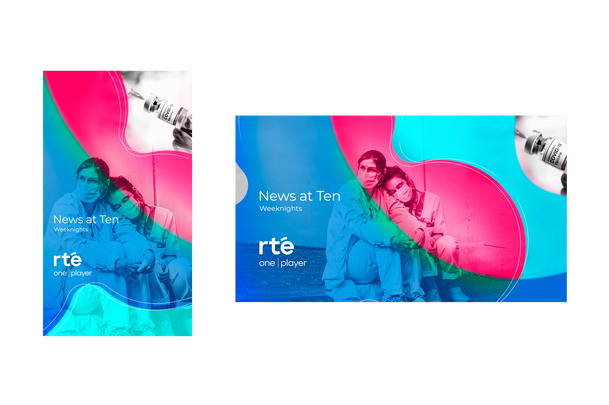
The key visuals show creative development from the first stage of designs demonstrating how various shapes would hold content through to developing the shapes into an organic evolving aura using eye-catching colours. The last key visual was presented
in the deck. This was the first stage of the pitch.


